
This new condo in Manhattan was inspired by a 1970s era design forward toaster oven
Can Modernism Be Stopped?
I have been asking myself that question lately as I read about trendy new condo developments without opaque walls, details or storage space. These places are being successfully marketed to people on the basis of "light and air." Since there was certainly light and air on site before there was a building there, you'd think these places would be going pretty cheap, but you'd be wrong. Apparently all that nothing adds value to the unit, a postmodern irony probably not lost on the developers or real estate agents.
It does seem to be lost on the architects themselves. From this piece in the NY Times, check it out while it's still free:
"I've had friends walk in and say: 'What is the story in this room? How does the Asian stuff work with the modern? I don't get it!" Mr. Jaklitsch said. "The story is just that I respond to anything that is rigorously designed."Here in Chicago, Modernist boxes have been big (literally) since the Mies invasion of the 1950s, which has left glittering empty boxes scattered around the city like old aquariums in a crazy old man's junk-filled back yard.
Which explains why this lover of Mies is living in an archetypal prewar apartment building - one of five Emery Roth buildings designed for the real estate developers Bing & Bing in Greenwich Village just before the Depression . . . It's sort of a joke, Mr. Jaklitsch said, but kind of true that when he learned that Mies van der Rohe had, in fact, lived in a prewar building himself, Mr. Jaklitsch thought he "could cope with this one."
Also, as he pointed out, it's rigorously designed; its gracious proportions are an Emery Roth signature. R. A. Sassone, a vice president at the Corcoran Group who
handles sales in many of the five Bing & Bing buildings, said it's a truism among fans of the Village quintet that if you are blindfolded and led into one, "you can't tell which building you're in." All have the same low and lovely beamed ceilings, brick fireplaces and cloistered bedrooms. Mr. Jaklitsch said he loved the proportions of his 800-square-foot home . . .
Since moving to New York City in 1994, Mr. Jaklitsch, who grew up in Maryland and took his architecture degree at Princeton, has lived in the same four-block section of the West Village.
"I hate the grid," he said, "and I love the trees."
This regrettable tradition has lingered on in the Soldier Field renovation, which defaced a monument to American war dead to further the economic fortunes of a really crappy football team. Also notable is our glorious new Millennium Park, featuring bridge over Columbus Drive which is too delicate to handle Chicago winters, and has to be closed when it snows. Our grandest new Modernist project is the billion dollar expansion of the McCormick Place convention center, which is transforming block after block of the South Loop into a hermetically sealed concrete and glass bunker, barricaded off from the life of the street.

We have seen the future. It looks like a parking garage.
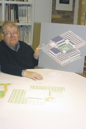
Which gets me all conflicted when it comes to Stanley Tigerman. I want to like the guy, I do. He seems to be a good guy. He and his firm design Holocaust Museums, headquarters for nonprofits, and low-income housing. He believes in using architecture to effect social change in a way that's almost touching. But his buildings are often horrible and anti-human, because Modernism is anti-human, in a reductive, manipulative B.F. Skinner sort of way.
His headquarters for the Ounce of Prevention Fund hurts the most, because I support the organization and what it's trying to do. But it looks like a fake little strip mall that should be surrounded by parking, even though in fact it isn't, it exists in the shadow of the Illinois medical District like Hobbit holes build over by Wal-Mart and Ikea.

Tigerman's Educare center is both nobly intentioned and, esthetically speaking, patronizing, silly, and contemptuous of humanity
Alas, Tigerman has been given the job of designing the new facility for the Pacific Garden Mission, perhaps Chicago's best known homeless shelter. Pushed out of the gentrifying South Loop by a public school expansion, the mission will be rebuilding nearby on a larger parcel of land. Tigerman plans a new campus-like atmosphere with "indoor streets" and enclosed garden spaces for programs and recreation. I've never felt so scrooge-like in my life and I want to be supportive of the new project. But I have grave doubts about this opportunity for Chicago's poorest to share in the aesthetic ugliness which has heretofore been the province of the rich. Is the enclosed design really an attempt to keep the homeless safe from the outside world, as Tigerman claims, or does it function as a way to keep unsightly poor people locked away from the rest of us? Who can tell the difference between a school, a prison, or a townhouse development these days?
We don't need our relationship with space redesigned by architects. We have a pretty good system - shops and residences with clearly visible entrances, squared off to make the most efficient use of space, close together to create a high enough density that you can walk to stuff. Where a door is, how a building relates to the street, these "problems" were solved long ago and do not need to be re-examined.
Modernist ideas are made worse by two trends visible in new buildings - lack of decoration - because builders are cheap, not becasue sleek is beautifuls, mostly it's just boring - and the privatization of public space. Buildings are turned away from the street, their doors are hidden, they look inward instead of outward. Why? because so many people are used to traveling from place to place in a car and aren't used to approaching a building on foot anymore, and because all you wussy people are so afraid of crime all the time so you are fleeing the life of the street (Again, is the building design really to keep the homeless people safe from the street, or the other way around?).
Perhaps the greatest example of this kind of folly is Zaha Hadid's award-winning firehouse in Germany. The building was quite useless to actual firefighters, so it became an art museum, and an exeptionally ugly one. But since it boldly challenged conventional thinking about the use of space or something like that, it was regarded as brilliant and catapulted the architect to fame. Previously she had been known for designs that were impossible to build. Now that she had succeeded in building something perfectly useless, she was hailed as a genius.
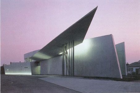
This misshapen pile of concrete is not construction waste, it was built this way on purpose and won a design award.
Hadid has since designed the Cultural Arts Center in Cincinnati, where her patrons will not admit they think her building is weird and ugly, in classic "Emperor's New Clothes," for fear the art world will think they're a bunch of rubes in Cincinnati. (Not exactly a state secret anyway)
Look, guys, you did the experimenting, and it failed. Most people hate what you do. We like brick houses and Greek columns on courthouses because they're useful, they make us feel a certain way, and they communicate their purpose and function to us clearly. Furthermore, the basic design of human habitation - the city grid, courtyards, doors facing the street, storefronts and townhouses - goes back as far as Domascus and is found in every civilization, because it works. It just doesn't need to be rethought for the new century.
People don't like modernism. Not only should this stuff not be built anymore, builders should be required to express an appropriate amount of contempt and scorn for modernism. They should be able demonstrate an ability to mock it in a way that is knowledgable and truly funny, revealing that they know why it is bad. They should design buildings that do not build on what the modernists did at all, but instead respect the design of the city, tradition and humane ideas of truth and beauty.
The trees are great, guy. But the grid is human.
Note: I am sorry this post doesn't even live up to my usual modest level of writing and logic. I have been working on a much better version of this post for a month, and Blogger ate it. I came very close to throwing this whole computer out in the alley at one point this evening.
2 comments:
From the Jan 7 Trib article regarding the BP bridge:
"Getting you to the other side of a street or river is not always the main goal when a bridge is designed, experts said."
WTF? What *is* a bridge for, then? Is it a marketing opportunity for BP? A scheme to create jobs? What?
I must register a complaint about your views on modernism--it can be appropriate in certain times and places. But it cannot be "warm," as van der Rohe claimed about the SSA building. I love the look of Hadid's German firehouse, I think it would be cool to visit the art museum (as long as the art was also suitably swoopy and Jetsonesque) but I'm appalled that she claimed it was a firehouse and does not seem concerned that the firehouse bits are not functional. It says much about the architect if the building cannot be used for the purpose it was designed. How much research did she do, anyway? It's artistry and not architecture, just like the BP bridge. I'm okay with that, as long as people know what they're paying for.
Oh, and also? I've got to weigh in strongly against pants, which is why you'll never get me into a glass house no matter how much light or air you put in it.
The NYTimes is always free for blogs; use this site to get your RSSUserland-sponsored NYTimes permalink:
http://nytimes.blogspace.com/genlink
Post a Comment