Before
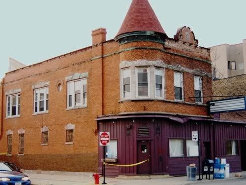
This building was a neighborhood landmark and a favorite. It was demolished because it was too small, and didn't feature any condos with balconies like the rich people like. They are willing to accept less footage to be able to live close to cool people like me, but they demand a view.
After
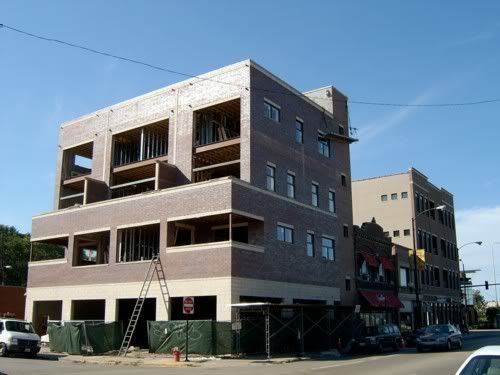
The big problem with this building is that it faces the wrong way. It ignores Damen, Bucktown's main thoroughfare, in favor of Shakespeare, which at a quarter-block south of Webster is not even a real street, since it doesn't fit the grid. From it's balconies, the moneyed classes will be able to gaze south along Damen and see the trendy business district with its boutiques and restaurants and funkily dressed babes, oblivious to the way their homes have deteriorated the quality of life for everyone around them. By facing south, the building presents a side view to Damen Avenue, with little bathroom windows that are asymmetrical, too much empty brick, and the edge of the balconies visible on one side only. In short, it's lopsided, deformed and ugly. The designers apparently decided that if they put retail with an attractive awning on the ground level, nobody will notice how the little group of buildings has become scarred and disfigured.
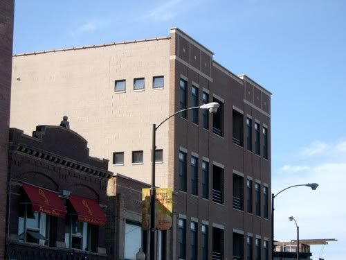
The new condo building at the corner of Damen and Webster, by contrast, faces the right way and even manages to present an attractive and fairly symmetrical face to the residential side street.
Before
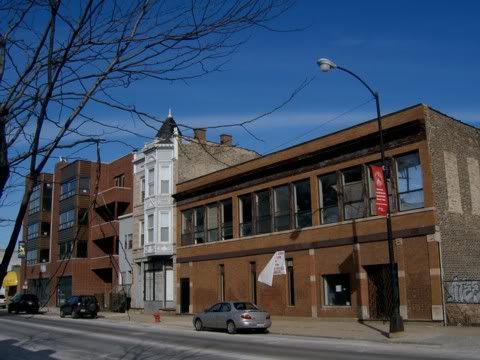
An attractive two-story commercial-residential building with decorative 19th Century iron metal details. Not enough units on the property, once again no balcony for rich people to store their bicycles and gas grills.
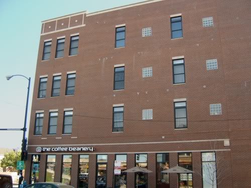
After
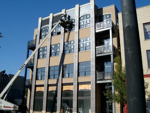
Fairly attractive modern commercial-residential condo building going up on a portion of the site. This building pays more attention to detail than do most new condos I've seen, the splash of color brightens up what is quickly becoming another shopping/residential quarter. I am pleasantly surprised. An identical building will rise next door, and then a skinny half-building that will look like the right half of this one, on the site ofthe old building. Unfortunately, this four-story complex will pretty much overwhelm the pretty Victorian turret next door.
Still, as industrial uses fade from the area, they are trying to extend the Wicker Park trendiness all the way up to the Congress Theater and beyond. Unfortunately, retail jobs do not pay what industrial jobs did, and people who work in these buildings could never dream of living in them, or increasingly, living in the neighborhood at all. Fortunately there is an El stop a couple blocks NW on Milwaukee.
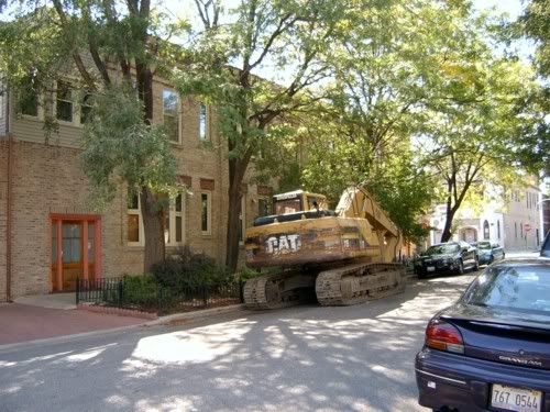
Well, another digger, signifying another teardown is about to take place. I took pictures of all the likely suspects, but I was wrong. A little house that used to be a storefront was the victim. I don't really remember it and I walked by it several times a week for three years, so it's probably not the biggest tragedy ever. Still, I wish these people would leave my neighborhood alone. They are filming a movie here tomorrow so we won't be able to park on our own street. Maybe once people see the 'hood on film, someone (like the Alderman) will conclude it is worth something more than the value of the land underneath it.

This doesn't really mean anything, Trope took it and it's just cool (I played with the color a little to make it pop more). If you have any idea what it might represent, drop me a line.
4 comments:
HEY! Why don't you put up your picture??
Yeah, doesn't it just break yer heart when beautiful buildings are taken down and replaced with ugly ones. It's just so ridiculous, even though it can be so easily explained by economics. What can't be so easily explained is why people put up with it. I suppose aesthetics isn't as important to people in this age where our attention spans have been so diminished and we're so visually distracted by the millions of advertisements clammouring for our attention. A lot of the painters in my MFA program often feel like giving up on painting 'cause they think, "What's the point? Nobody has the patience to enjoy a damn painting anymore." I notice my own art being affected as I introduce more and more bright colors and visual noise into my work, and focus more and more on teaching for a living.
So why does trope's picture have to mean anything? It looks like it's meant to be art, and art should be enjoyed, not explained. It is lovely BTW.
Isn't a dandelion a weed? It looks like it is invading the shadow, preparing to take over, from the inside out. Kind of like all of the new condos in your neighborhood. Q.E.D.
Bob--heh, that sounds accurate. "Feed me, Seymour, feed me!" Marf--thank you! I was trying to get the dandelion where my mouth should be, but it didn't come out clearly in the product. There are a couple others in this series (did you hear me? I said "series"! Like an artist or sumthin!) but I haven't gotten out the camera to look at them yet. Elwood has one of his own.
Post a Comment